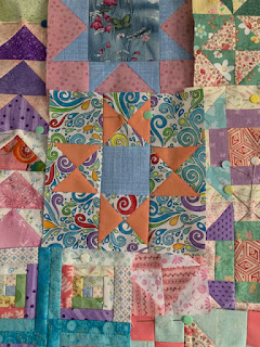
I got permission to use these pictures to help explain why contrast in a quilt block can make all the difference. We have a small group of ladies doing the Heartfelt BOM quilt. We are getting together once a month for a sew day, to work on our blocks and to enjoy the company.
One of the ladies doesn't normally do scrappy and so she is having some difficulty with fabric selection, to make something that she likes. So she asked for some help with making some combinations that would go together. Initially when selecting fabrics, her tendency was to pick fabrics that basically all read as medium.
An example of this was the first Ohio Star block she made. It is not pictured here, but the one on the right hand side has parts of the pieces for comparison. The star point unit, top row middle unit....there are two fabrics there. A purple floral and a multi coloured floral. The first block had the multi coloured floral for all of the background. She asked me what I thought, and I suggested, that there was not enough contrast, that the block read as one colour between the star points and the background. So she tried to change this by replacing the corner units with a white. There is contrast, however when I first saw this block in a text message, I thought it was a new block she decided to add to her quilt, as it read, to me, as a plus (+) sign. The star points were still lost.
Contrast can come in many different forms. You can use one of them or many of them in a block. First contrast most people think about is light and dark, there are different colours, patterns, scale. You can have an all blue block, and still achieve contrast by varying the shades of blue or the saturation/intensity of the colour and more.
So I went on to explain to her that the reason the first and second options don't really work, is because there is no contrast between the element that is intended to stand out (ie the points of the star). That the two colours in that unit are so similar in colour as well as scale of design, that the eye just mushes it all together.
Later, when she came to me with her third version (the one on the left above), I thought wow, she has really gone wild! She has varied the scale (as I mentioned) by adding a large scale background, against a darker purple with small white polka dot, plus a yellow with a salmon grid for the centre. The two blocks have a completely different feel to them. To some the one on the left may be a bit loud, as the background is trying hard to steal the show, where the star points really should be the star player, but there is just enough contrast in the deep colour of the purple that you can tell it is an Ohio star.
Her second new version of the Ohio star is also out there with another busy background, though this one the star points stand out a bit more, as the orange points, that are a solid, are a contrast to the primarily blue busy design of the background.


No comments:
Post a Comment