Sunday, 11 February 2024

An experiment for me, with one piece of fabric

There are many different names for this technique that I am about to share with you.  I call my version Kaleidoscope quilt and it all starts with one piece of fabric.  I didn't take a class or anything, so didn't know exactly what to expect, but I saw this somewhere a long time ago.  

This is a piece of Kaffe Fassett fabric, in his usual very colourful theme.  Not sure what it really is, but to me, I am remind of snail shells, by the spiral shape.  This fabric has a repeat every 21", though I am sure you could used bigger or smaller.  If you are looking for something to follow, I know that Jordan Fabrics has a pattern where she goes over how to make a similar quilt, minus the sashing that I made. 


Basically, you need to find out what your repeat is and multiply that size by 6, to determine the amount of fabric you need.  If you want a bigger quilt, you may have to double that amount, as you always need 6 repeats.  You will also need a 60 degree triangle ruler.

You will cut out 6 repeats exactly on the same spot.  Once you have those cut out, take them all and stack them on top of each other.  Pick a spot on the pattern that you can poke a pin through all the layers, in the same spot, so that they are all positioned exactly the same.  This last part is important to make the design work.  

Next you will cut strips from your repeat.  I cut my strips 3.5" wide by the width of fabric.  Keep them all together in the same position.  You are going to want to cut carefully with your 60 degree triangle ruler, first upright and after upside down, until you cut the whole strip.

As the cut pieces measure the same on all three sides, you will have three different options on the design that you settle with, when making your hexagon shape.  After they are cut, keep the identical stack together. you can separate the pieces and match the points in the centre, when you place them side by side.  Make sure the centre of each are all the same (see pictures below for examples). 


I know these are bright.......ok, very bright and not what I was expecting, but there you have it.  One of my wedges turned out to make this kaleidoscope design.  If you want to know where this comes from, look above at the fabric piece.  this little section is located on the bottom right hand side, right on the crease in the fabric that I didn't iron before I took the picture.  Can you see the pink snail shell on the crease, the blue shell to the left of it and the yellow one just above them?  That is the section that this wedge came from.  Doesn't look at all like the fabric any more, does it?


The above hexagon comes from the pink and brown shell close to the top centre section of the fabric. This wedge picked up the small orange shell above the dark pink shell plus the yellow shell above the orange one.  Quite different!  So I am sure you get the idea.  Try and see if you can figure out where this next block comes from.


Can't find it.........sorry.......that would be a trick question, as this wedge section is on the other side of the folded fabric.........lol......sorry.......I didn't mean to do that, but left it in here anyways.

As mentioned above, these hexagons are very bright and loud.  Once I placed them side by side it was chaos.  I just couldn't handle it.  That is why this quilt sat aside for the longest time.  I just couldn't handle the chaos.  Eventually it came to me, that if I separated the blocks with a sashing, it would tone down the overall pattern, hence why I added the dark brown 1/2" finished sashing around each block.

This is what you get when all the hexagon blocks are assembled into a quilt top!  I didn't have any repeats, because I only used the one set of repeats.  Enlarge the picture and check out all the different designs that are made.  


It is amazing how different they are and they all came from the same piece of fabric.  This quilt is going to Project Linus.  Some child is going to love the bright colours, as children always do.

Take care everyone!

Tuesday, 6 February 2024

Pulled out my Summer Sampler wool wall hanging again

I had a really nice weekend.  Had a sew day with a friend on Saturday, and another sew day on my own on Sunday.  I got a bunch of little things done, but no pictures yet to show you.

Toward the end of the afternoon on Sunday, just after having my afternoon tea, I decided that I had enough of the fast pace, of trying to get loose ends complete.  That is when I decided that some quiet time was in order.  So, I pulled out my Summer Sampler wool wall hanging.


I finished the centre of the wall hanging a while ago, and during my trip to Ottawa with my husband and son, I took the back seat and did the handwork of the flowers for the borders.  The whole piece got put aside yet again, for other things that I was working on.  

Later again, I pulled it out and thought I would work on it some more.  That was when I traced out the vine and stitched it up......all except for about six inches.  I don't know why I didn't find some time just to sew that six inches up, but.....I didn't.

Sunday I decided that it is time to see this one done.  I did finally finish the vine and I started on the leaves.  There are 24 leaves in the border and I managed to get four of them done, on one of the side borders.

It appears that this week will mostly be non-quilting related stuff going on with my son coming home from school for the weekend starting Thursday, his birthday.  I am just hoping that the wall hanging doesn't get set aside yet again......wish me luck!  Just 20 leaves left to go, and I can quilt it.

Monday, 5 February 2024

Contrast in a quilt block

I got permission to use these pictures to help explain why contrast in a quilt block can make all the difference.  We have a small group of ladies doing the Heartfelt BOM quilt.  We are getting together once a month for a sew day, to work on our blocks and to enjoy the company.  

One of the ladies doesn't normally do scrappy and so she is having some difficulty with fabric selection, to make something that she likes.  So she asked for some help with making some combinations that would go together.  Initially when selecting fabrics, her tendency was to pick fabrics that basically all read as medium.  

An example of this was the first Ohio Star block she made.  It is not pictured here, but the one on the right hand side has parts of the pieces for comparison.  The star point unit, top row middle unit....there are two fabrics there.  A purple floral and a multi coloured floral.  The first block had the multi coloured floral for all of the background.  She asked me what I thought, and I suggested, that there was not enough contrast, that the block read as one colour between the star points and the background.  So she tried to change this by replacing the corner units with a white.  There is contrast, however when I first saw this block in a text message, I thought it was a new block she decided to add to her quilt, as it read, to me, as a plus (+) sign.  The star points were still lost.

Contrast can come in many different forms.  You can use one of them or many of them in a block.  First contrast most people think about is light and dark, there are different colours, patterns, scale.  You can have an all blue block, and still achieve contrast by varying the shades of blue or the saturation/intensity of the colour and more.  

So I went on to explain to her that the reason the first and second options don't really work, is because there is no contrast between the element that is intended to stand out  (ie the points of the star).  That the two colours in that unit are so similar in colour as well as scale of design, that the eye just mushes it all together.

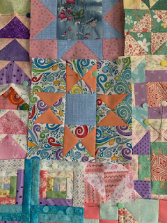
Later, when she came to me with her third version (the one on the left above), I thought wow, she has really gone wild!  She has varied the scale (as I mentioned) by adding a large scale background, against a darker purple with small white polka dot, plus a yellow with a salmon grid for the centre.  The two blocks have a completely different feel to them.  To some the one on the left may be a bit loud, as the background is trying hard to steal the show, where the star points really should be the star player, but there is just enough contrast in the deep colour of the purple that you can tell it is an Ohio star.

Her second new version of the Ohio star is also out there with another busy background, though this one the star points stand out a bit more, as the orange points, that are a solid, are a contrast to the primarily blue busy design of the background.


These flying geese, also made by the same person, are a perfect example of contrast.  Mostly in colour, but there are also some different design scale going on as well.


This next one is another example of changing up the contrast.  We have a medium scale print on a blue background paired with a smaller scale green floral design for some of the geese and the other set are a small scale floral on a darker pink, with a larger wavy strip design that adds some movement.  These blocks are showing varied texture, scale and colour.


These geese have the contrast, but are more tame than the first group above.  The first group above will catch your eyes more, as the colours are more saturated.  Both options as well as the more wild Ohio star have their place in the design element.  The trick is to know where to put them in the quilt to enhance each other.  Not everything has to be in you face grab your attention and not everything should be dull or boring.  A mixture with just the right dose of each, makes for an eye pleasing quilt in the end.

It is hard at times to select fabrics, because obviously you want your quilt to look good, but until you try different things and find out what you really like or don't like, you will not come to know your own signature style.  Remember everyone has their own taste.